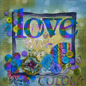
I had such fun, I used alcohol inks on photo paper and metal foil to create the title and the flower and the clock. I also used them on the fragments to show something different.
All in all, I used Distress Ink and Alcohol ink for this page with some Perfect Pearl mist on the dark blue sheet With some Cobalt blue Archival ink thrown in on the stamps for good measure.


Lovely, B: I especially like the way you have kept the colours crisp & clean in the Plaid & Stripe. Nice compass effect on the fragment, too- I remember the technique from Tim's class. What is next? Enjoy...
ReplyDeleteWhat a fun project! So colorful and happy!
ReplyDelete