Wednesday, 29 October 2014

What's on my Workdesk Wednesday 282? Coffee!

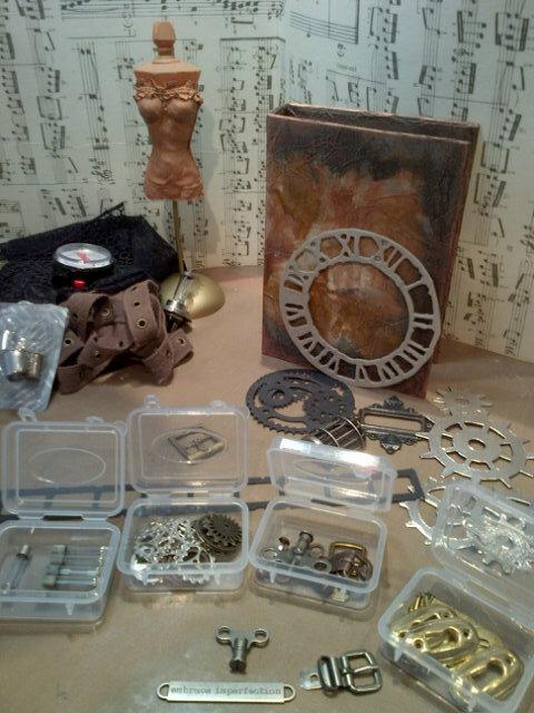
Hello fellow Desker from Julia's place, welcome to my rather uninteresting desk today!  I have cleaned and tidied and am ready for my next project...whatever takes my fancy!

I have been very busy with entries to challenges and along the way I experimented with some leather off-cuts I bought at a hobby Xpo recently with the aim of trying them out through my dies.  Then I had a brain wave and tried the die cut pieces through my embossing folders.  It works like a treat!

 The front and back of the embossed leather wings I used for the dress form above which I entered into the latest CC3 challenge.

 This is a couture Creation folder which fits Tims pocket watch die perfectly!
 So that's my desk this week...off to see what I can see on yours!

Saturday, 25 October 2014

Steampunk Dressform

I have been busy with this perfume bottle for a while now.  She was started as my entry into Sandee & Amelie's Challenge where the theme is Steampunk Couture and is due at the end of the month.

This morning, Linda loaded challenge 14 for the Compendium of Curiosities 3 series and so I decided to combine them both!

This is how she came out of her box...a cheap China Town find a few months ago...purchased with altering in mind!
 This is how far she had gotten by last week-end, cos then I got distracted by my worn cover and so the poor thing has been sitting in her undergarments all week!
 When I went to a hobby xpo recently, I purchased some leather off cuts in various colours to try and die cut.
 I discovered the leather cut beautifully with the steel rule dies and then I decided to push things a little further and ran the dragonfly through its embossing folder!

 Here you can see her after I have applied the technique from page 53 of Tim's book, Compendium of Curiosities 3 to her bodice.  I can't tell you how I did this bit as those are the rules over at Linda's place where the whole point of the challenge is to work from your own copy of the book.
I used alcohol ink on the base of the stand as it was just too solid gold.
 I dressed her in a leather cog collar, leather dragonfly wings, seam binding tied with an idea-ology cog and pin as her waist (more like her hips...) band and couture lace for her skirt.
 I softened the harsh look of the alcohol ink on the base with some distress paint to give it  more of a marble look.
 Then just to push the Steampunk boundaries a little further, I took her perfume lid off and added a light bulb!
 I love how the leather embossed so well, It is such a pleasure to work with and smells so good!
So this is my entry to SanDee and Amelie's Couture challenge whose prize sponsor is Tando as well as Linda's challenge where the Curiosity Crew's Choice gets a prize sponsored by Tim and Mario and there is a lucky draw sponsored by The Funkie Junkie Boutique as they sponsor the even numbered challenges!

CC3 Challenge 13 part 2: Worn cover inside

As part of my CC3 Challenge 4 prize sponsored by Tim and Mario, I received these cool glassine pockets/envelopes.  They are just the right side for a size 8 tag and fit perfectly top to bottom in the cover too!  The only problem with adding them to the inside of my worn cover was if I punched them, they would get holes right where the tag would go inside...

Q brainwave!

I have this die called "tiny tabs and tags"
 I die cut 12 of the circle tabs.
 Then I punched holes in them once I had folded them all.
 Placed them on the ring binder, added glossy accents inside them, then slotted the glassine pocket into them and squished them down!
 Once I had one done, I could take it out the binder and place the next one on top and copy the spacing.
 I added some clear pockets to the front for now...they might be moved to between the pockets so the pockets can act as "dividers".
This is how they look inside the cover...now to decide what to store in here and decorate them accordingly!

I have already added the cover to the challenge over at Linda's place, but now I am adding part two for fun, even though the next challenge is up!

Friday, 24 October 2014

New look for my Blog

Hi there

You might be forgiven for thinking that my blog has had a multiple personality of late...

I have been doing lots of research and trying new things out to see if I can do the background stuff and get the look I want for my blog myself.  It has been a learning curve of NOTE, in fact, I would go so far as to say that there was no curve at all, rather a perpendicular line going straight up!

But I persevered and I think I have it looking how I want it for now! (there might be a few more tweaks coming) I still want to try and create a blog header that I like, this is currently the text which Blogger has available.
What do you think?

Hope you like it!  Please let me know if I need to change font colours or anything else as my 21" screen and yours will be very different which I discovered when I viewed my blog on my DHs 17"screen across the room!

Even worse, I have just looked at it on my dinosaur of a computer at work (screen shot as seen below) and you can't see any of the side image...oh well, cant't win them all!  Makes me wonder what you see?

Thursday, 23 October 2014

Playing with Canva

Hi there

As part of my mission to get more "on line friendly"  I am investigating all sorts of things.  One of which has been blog Graphics.  I have come across a site called Canva and they are awesome for making your own graphics.  It is so user friendly.

This is the photo collage I put together using their site.  It was made in the Pinterest section so it will be the right dimensions to show up well in Pinterest!  This is my test run!
If you want to see how I made this project please go to the post here!

Wednesday, 22 October 2014

What's On My Workdesk Wednesday 281? Free On Line course!

Embedded image permalink
Hello Fellow Deskers from Julia's place and visitors from Blacksburg Belle!

Above you see me "shopping my stash" for the worn cover I was busy with on the week-end...not much has happened on my desk since then!

Here is the finished worn cover.
Since finishing my cover and putting it "out there", I have had many peeps asking me to teach it which got me onto the subject of doing on line classes...the only question I have is how?
This got me thinking about all the work I put into the creative classes I teach and have been wondering how to make them into online classes...The answer I think is in the course I am about to attend by April Bowles-Olin on CreativeLive on 10 & 11 November.
April asks us to pick one of 5 questions to answer as to why we want to do this course and I am going to answer 2 because I think they are pertinent to me.
Q) Why you want to learn how to create and sell digital products
A)  Who doesn't want to earn money while you sleep?  That is just so appealing!  I have taught real in person classes to students for 17 years and the amount of work in both prep and time is the same if you do it for a video camera or for an in person class(if you exclude the kits!).  The only difference is that the in person class is taught once (has kits which take hours to prep) and can only earn me so much...where as an online class can be repeated at the press of a button and can be earning me money every time someone purchases it and there are so many more viewers on line!
Q) The biggest questions you have when it comes to selling digital or information products?
A) Apart from the classes, I want to create digital cut files to sell.  How do I know if they will work on all the different machines out there if I only have one of them in my studio to test it on?
I also want to create videos.  We do not have great bandwidth here in South Africa and I am worried about the quality and what camera and programs to use to edit it. 
So my fellow Deskers, I know this post has been long and wordy...I am in no way affiliated with April or CreativeLive, but thought I would share this with you as we are all creative in some way with some or other medium and this is free!

This is the blurb off her blog: “Are you ready to make your creative work more lucrative, stable, and sustainable in the long-term? Join April Bowles-Olin for an introduction to digital products and how they can enhance your creative business. This course will show you how to produce and position viable products for generating multiple revenue streams and passive income. RSVP right here to watch it live and get access to the workbook for FREE. This post is part of the Create Digital Products blog tour.

Tuesday, 21 October 2014

Signature Issues...Fixed!

I created a signature for myself for the end of each post I write. It automatically adds itself when I hit publish! I did it in about June this year.  Recently I was fiddling (as one does occasionally) with the background/wallpaper for my blog...

Then I noticed that my signature had vanished!

I did nothing there or so I thought!

So...how had I created this signature back in June?  I could not remember!  Thank goodness for GOOGLE!  Yes I Googled "how to create a signature at the end of my blog" and up popped a few suggested sites.  I went to two that required me to use the HTML...all gobledygook to me, so I pushed on and found Code it Pretty  This blog explains how to do it in a way that even I could understand and so my signature was back, only so was the irritating photo background that I had got rid of originally when I lost my signature...they seem to be quietly and inextricably linked by Blogger in the back of beyond in the HTML mess that I do not understand, so I have re-deleted the photo and hopefully I am back in business!

If you need help with your blog, I do suggest you go to this Code it Pretty site.  Not because I get anything from sending you there, but because it helped me and so I would like to pass on the favour and help you if you ever need some blog tweaking advise or help!

Ultimately I am an artist not a techno geek...I just want to create, not waste time setting things up on Blogger!

Sunday, 19 October 2014

Compendium of Curiosities 3 Challenge 13!

This is a photo heavy post, so get comfy if you have the time.  Although I cannot tell you all the details on how I made this worn journal cover, I can show and tell the extra bits which I did to add to my project that are not in Tim's book on Page 35!  Go to Linda's blog to see more ideas by the Curiosity Crew for inspiration.

I started with a brand new Cover.
 Covered it with Gel medium
 Then adhered a sheet of gift wrap tissue paper which I had scrunched up.
 When the front was dry, I glued the inside and wrapped the paper round the cover.
 Now I had a textured cover, inside and out!
I started on the front cover with distress paint and water which takes an age to dry, but I prefer it to air dry than help it with a heat gun as it seems to dry more interesting when left to its own devices!
 You can see how much paler it dries below! 
 Once this was dry, I had run out of patience so I did the inside with a thin layer of paint and blended it with a baby wipe.  This showed up the wrinkles nicely.
 Once this was dry (which was quick!) I lightly smeared some bronze paint dabber onto the raised areas of tissue paper around the edge of the cover, inside and out.

 Then I set about making the decorations for the cover and shopped my stash for trinkets.
I added distress embossing powder to the clock die to make it look rusted.  
Here you can see how I plotted my layout before adding my stencils.
 I discovered a great thing about this stencil, if you stencil it straight first, you can angle it the second time and get a full second clock at the top!
as per below!
 This is the finished base for the front of my cover.
 The inside looked like this before I added the cut off piece of clock die.
 I used a brad though my ribbon, the buckle and the clock die to anchor it all in place.
This is how it looks from the top
 The clock face from the remnant rub fitted perfectly inside this Spellbinders cog die.
 For extra texture I added some flat backed pearls.
 The safety pin on the spine acts as an anchor for the excess ribbon once it is buckled up.
 The Antique bronze distress paint that I added to the metal cogs and word strip look  almost gold in these photos, but they are quite copper in real life!


 I added the off cut from the front clock to the inside cover of the back page.

 This is the buckle closed, as if the cover was full inside.  I am still working on the contents!
 Tim's buckle is such a clever piece of idea-ology.  Functional and good looking!
So this is my cover, inside and out.

If you want to join in this challenge, get yourself a copy of the Compendium of Curiosities 3 and go to page 35.  This is an odd numbered challenge, so the sponsor for the lucky draw prize is Inspiration Emporium who are giving a generous $50 voucher!  Tim and Mario sponsor an awesome selection of goodies as the prize for the person's project chosen by the Curiosity Crew.  To be eligible for this prize, you have to comment on every Curiosity Crews members inspirational piece and stick to the few rules Linda stipulates....